2013 westward ho! 3/?
Hello world....again!
Yesterdays post focused on the beauty and power of monochromes. I guess today we will play with color but talk about B&W. Perfectly strange I guess.
Whether I am shooting color or B&W on my digital cameras, I am always making a B&W JPG along side of a RAW (if I am even shooting raw). The reason I do this is to see the tones of the scene in monochrome and do away with the distraction of color. I think color, most of the time, is a distraction and jacks up our composition. We see lines and form better and more clearly in B&W. We always have. When my son Scout was born, we were told that the first books you buy a baby are bold B&W graphic element books. Because babies can not see as well as we can until they are around 6months B&W is the simplest thing to understand, the contrast will hold their attention more plus looking at zebras and pandas all day is pretty cool as a kid. So why wouldn't that carry through as an adult? I think it does. Most of the photographs that are good enough to be etched into my brain from past masters are B&W. Very few color images reside up there. Maybe its just me but I think 90% of the time a scene in B&W is stronger than the same scene in color.So try the B&W jpg thing and tell me I am wrong. You will see things that you wouldn't have seen in the scene had you previewed in color.
SO.....the hard thing is remembering what shots I see in color and what shots stay B&W. These are a select few that made the cut for me in color...
Keep on clickin'
parker j
Badwater, Death Valley NP, CA
Lone cactus at sunrise in Death Valley NP, CA
Road to Zabriskie Point, Death Valley NP, CA
Stars, candybars and tumbling tumbleweeds in Bisti Badlands Wilderness, NM
Homestead and north star along a Colorado roadside. The world just kept on spinnin’.
The wall of the Bottle House in a ghost town named Rhyolite, NV.
Snow storm passing over Paunsaugunt Plateau in lower Utah.
The 60 second clearing of a snow storm at Bryce Canyon NP, UT
Lone tree in Bryce Canyon NP, UT
Alt color image of Bryce Canyon NP, UT
Trees, clouds and sunrise in Zion NP, UT
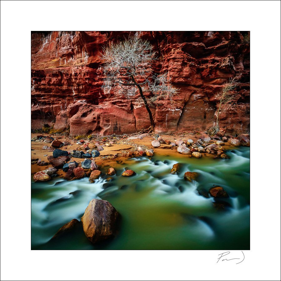
Cottonwood against cliff in Zion NP, UT
Cottonwoods backlit in Angels Landing, Zion NP, UT
Tree and The Virgin River in Zion NP, UT
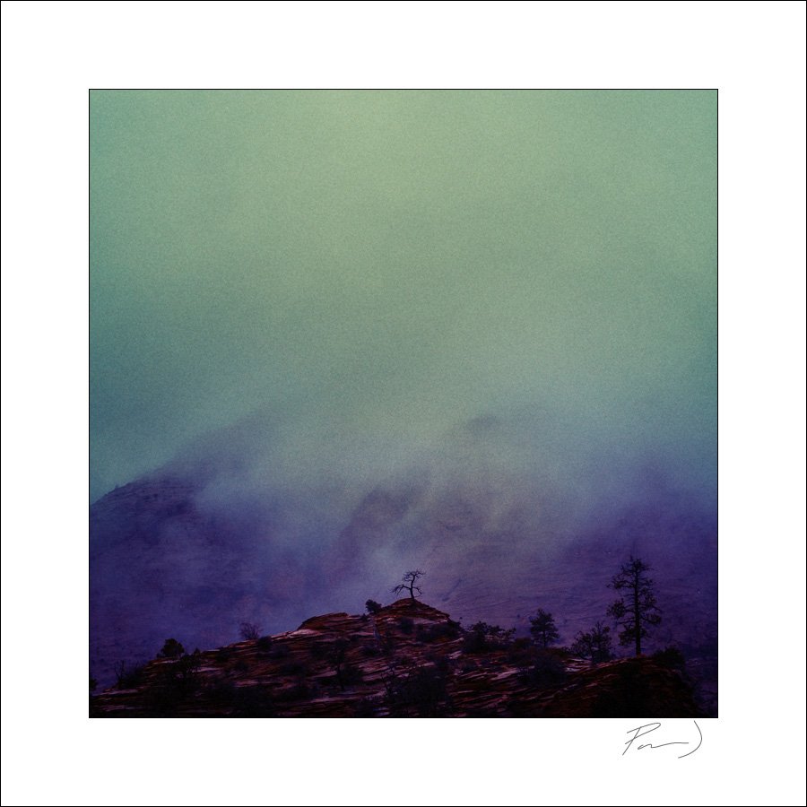
Lone tree in clouds at Zion NP, UT
Lower Antelope Canyon, Page, AZ with color balance as viewed.
Tumbleweed in Lower Antelope Canyon, Page, AZ with color balance slightly altered.
Lower Antelope Canyon, Page, AZ with color balance as I saw it. and filtered
Lower Antelope Canyon, Page, AZ with color balance as I saw it. and filtered
Lower Antelope Canyon, Page, AZ with color balance as I saw it. and filtered


